3D Model QA Tool
Overview
-
All 3D models that go onto Wayfair's customer-facing site need to be modeled and reviewed for quality assurance
-
The tool that allowed 3D QA employees to review the models required them to open several tabs to view images
-
I interviewed 3D QA employees and redesigned the application to help them work much faster
Skills
User Interviews, User Flows, Information Architecture, Sketching, Prototyping, User Testing, Wireframing, Visual Design, Persuasion, Presenting
Time Frame
Designing in 1-week sprints for 3 months (June 2018 - August 2018)
Role
Sole Product Designer; working with a PM
Outcome
After user interviews and user testing, we successfully designed and launched a redesign of the 3D Model QA experience:
-
Vastly improved workflow efficiency of 3D model QA employees
-
QA can be done on one screen rather than reviewing multiple windows across multiple monitors
-
QA checklist was built into the workflow and is in the same window, compared to prior workflow where an excel sheet was used
-
Increased rate at which 3D models were QA'd by the QA team
3 years after launch, I received positive feedback from the business and QA team that this was an incredible redesign that solved a complex problem allowing team members to work much faster

Problem
Too many tabs
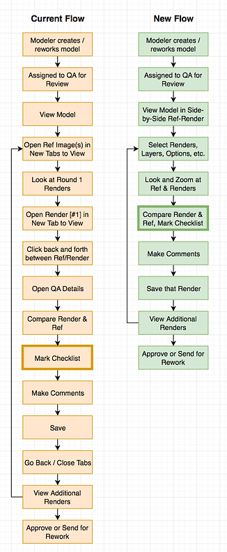
The workflow for 3D QA was:
-
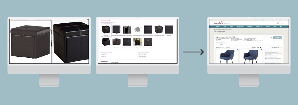
Open a 3D model ready to be reviewed for quality assurance
-
Review reference images (these are the images that suppliers will submit in order to get a 3D model made)
-
Review 3D model image
-
Mark a separate checklist with concerns
-
Make comments on each 3D model image
-
Approve or send for rework


The biggest problem was having to open every reference image and 3D model image in a separate tab because they were too small to see on the screen, but there were other issues like the existing checklist was in a spreadsheet that was separate from the tool.
Moving through all of these tabs and windows was wasting time, and I decided to interview four 3D QA employees to learn more about their workflows and pain points.
Research
User interviews and affinity mapping
I interviewed four 3D QA employees by asking them to walk me through the process of reviewing a 3D model.
I was surprised at how long it took to open several tabs (sometimes up to 10) to review images and open separate pages to make comments while reviewing a separate checklist.

I created an affinity map that summarized their main pain points. Each yellow sticky note was a bullet point I took in my notes when interviewing them.
Problems ranged from:
-
Separate tabs take too long to review
-
A checklist built into the tool would help provide structure and prevent them from having to leave the page
-
Dimensions and other metadata were found when scrolling in the current tool, they'd rather see the dimensions at the top near the images
I put together a workflow of how they were currently spending their time reviewing 3D models, and then made an idea flow.
Design
Low fidelity mocks and user testing
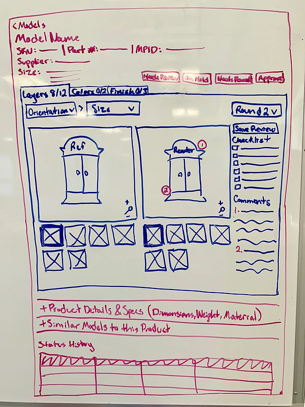
Next, I whiteboarded a side-by-side view of the reference images and the 3D model so that everything was on one screen.

I mocked up a low-fi version and tested it with 3D QA employees by asking them what they saw and what they thought they could do. They understood that they could leave comments on the 3D render, and mark what was good in the checklist next to the image. They loved that they could see everything all on one page.
They asked if there was a way to see a full-screen view of the 3D render so they could see all the details.

I created another low-fi mock that gave them the ability to switch back and forth between a side-by-side view and a single view of the 3D model.
They didn't notice the number of rounds, so I decided to move that for the next round of mocks.
High fidelity mocks and prototyping
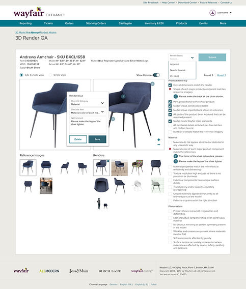

The high fidelity mocks made use of our enterprise design system components. I created a prototype to test with the 3D QA employees, which featured:
-
Side-by-side and single view to prevent opening so many tabs
-
I moved the "Rounds" to the top because they didn't notice them in the low-fi mocks
-
All dimensions and important information was moved to the top of the page, so it's the first thing 3D QA employees see before looking at the 3D model (information they deemed as less important was moved under the thumbnails)
-
The checklist on the page keeps them from having to use a separate spreadsheet
New use cases
Introduction of options
After the high fidelity mocks tested well and were engineered, we learned about a new set of tasks for 3D QA employees.
They had to review "options" of products, which meant that models now how different colors, materials, and patterns. This meant we had to solve for this use case with our previous solution.
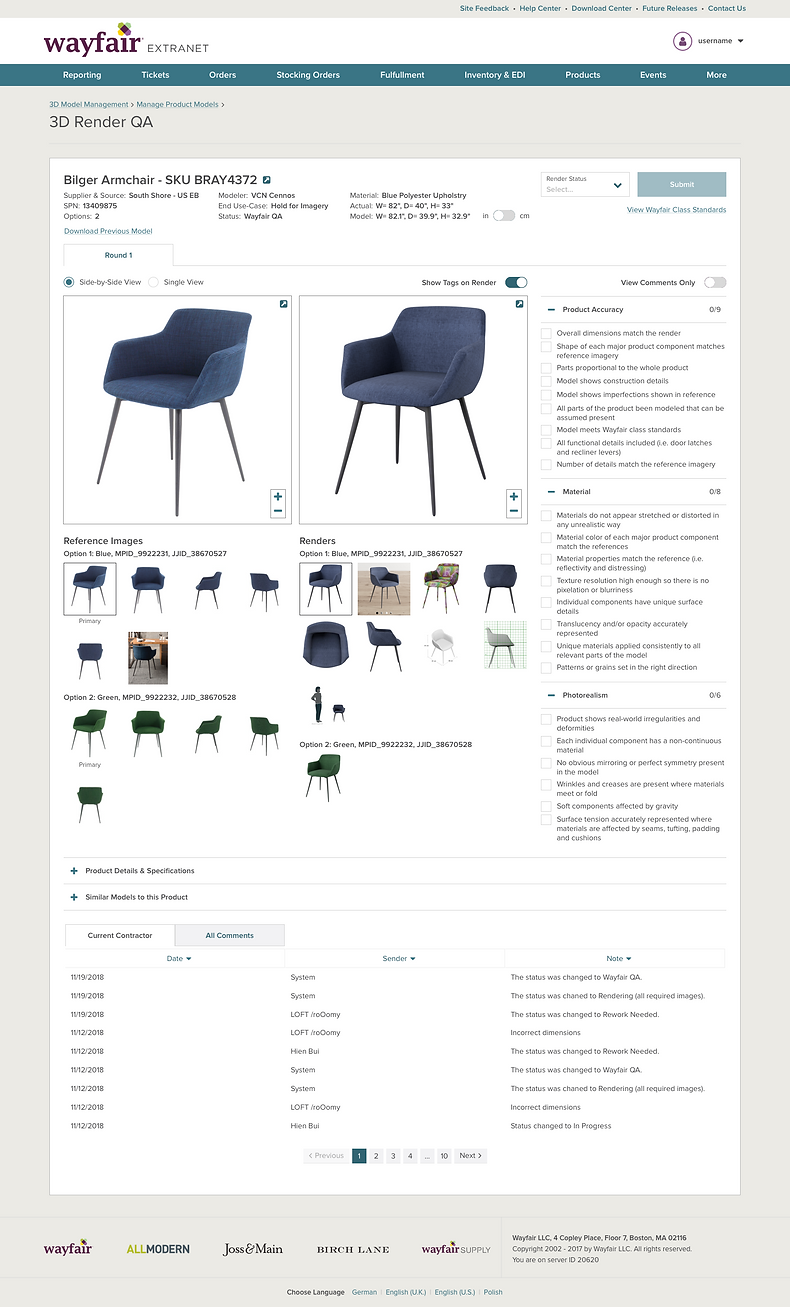
I added sections for the options within the image thumbnails so that each option was grouped (ie. blue, green, etc.).

Here is the engineered 3D Model QA Tool! In 2021, three years after the redesign, I received positive feedback that this solved a complex problem in a small amount of space and still allows 3D QA employees to work faster.
Next Steps
The 3D Model QA Tool has been live and in use since 2018. It will be improved again with all other supplier applications based on the new Wayfair Partner Home Design Vision that I helped lead!