TeachersConnect App
Overview
-
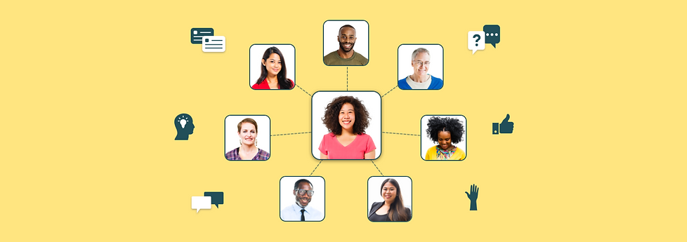
TeachersConnect is an ed-tech startup that aims to provide a safe space for K-12 teachers to post lesson ideas, ask questions, and form professional networking relationships with other teachers like them through an app
-
Analyzed initial company research on users: student teachers, new teachers, and seasoned teachers
-
User tested and designed the entire app through 1-week design sprints over 6 months utilizing the company's current brand
-
Successfully launched the app to the Apple App Store after designing over 150 user-tested screens
Skills
User Research, Brand Research, User Flows, Information Architecture, Sketching, Prototyping, User Testing, Navigation, Wireframing, Visual Design, Presenting
Time Frame
6 months of 1-week sprints (February 2017 - August 2017)
Role
Lead UX Designer in a start-up team of 4 people
Outcome
Successfully launched the first version of our TeachersConnect app to the Apple App Store:
-
Designed and user-tested over 150 screens from sketches to high-fidelity
-
Based on research of teacher needs and testing data throughout the year
-
Launch of the app secured funding for our start-up and locked in new partnerships with alumni programs to help the company get a regular stream of income
-
Hundreds of teachers from alumni programs started joining and had a safe space to share questions and connect with one another
User Research
Before I joined the project
I started this project by reading the research that the team did before I joined. 25 teachers were interviewed about what their teaching lives were like and what kinds of experiences were great in teaching, and what kinds of experiences that weren't so great. The team was wondering: What is it really like being a teacher, and what could make their lives easier?
"It's sort of lonely, you're stuck in a room with kids all day, and you really don't have a place to talk to other teachers."
-Jenna
"I live on a geometry island at my school. I try to share what I do with other teachers at my school because I need help, but no one shares back."
-Meredith
"When something works in my classroom, I don't want it to end there. I want to get it out to the world... so they can do cool things with their students."
-Josh
Many first-year teachers reported that they were nervous to ask questions in their school or didn't have the right people to ask questions. More experienced teachers said they were still looking to grow, but didn't have anyone to exchange ideas with.
From this, it seemed like an online tool that allowed teachers to connect with one another could be something that would improve their lives. The team decided from this research to make an app allowing this to happen. It had to be a secure and non-judgmental community that allowed teachers to form connections and share ideas. I was then hired to start the project.
Defining and sticking to our brand
After analyzing the research that my team did, we had to define what kind of company we wanted to be for teachers. This included our brand voice and design principles.
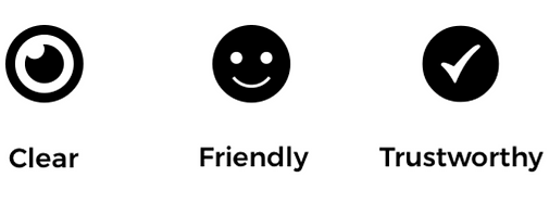
Our brand voice needed to reflect our values in order to create the kind of community we wanted to host. We needed to be clear what the community stood for: a cooperative and non-judgmental space for teachers. We wanted a voice that was friendly so teachers felt enticed to join and get the support they needed. Lastly, we needed to prove that we are advocates for teachers and that they always come first, and that we can be trusted.
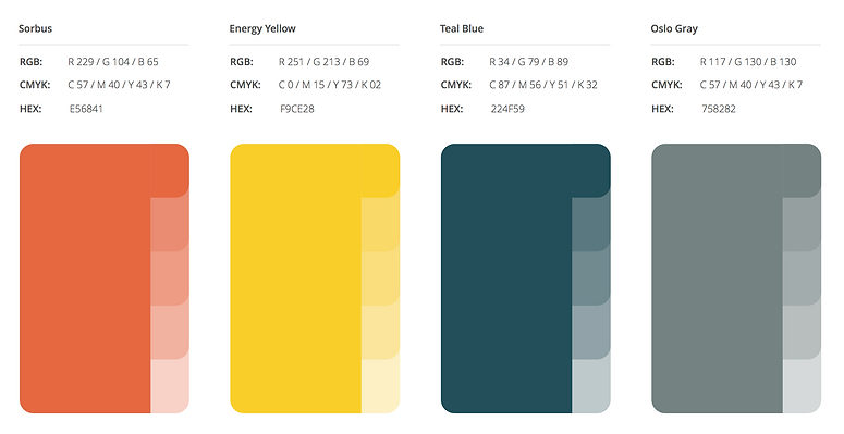
Our colors were chosen based on the three values of our brand voice. Sorbus for clarity, energy yellow for friendly, and teal blue for trustworthy. These colors were chosen by the team as a whole.
Defining the problem
Teachers need a safe and collaborative space filled with other teachers similar to them, so that they can exchange resources, share experiences, ask questions, and form connections to improve their teaching lives.
Design & Testing
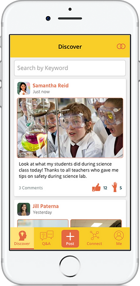
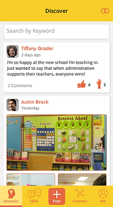
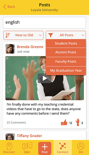
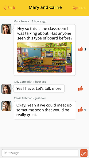
Discover section: Sharing resources, lessons, and stories
Based on initial research and interviews, it was clear that teachers wanted to have a tool that allowed them to share resources, lessons, and stories with other teachers.
Originally, our team thought of "Spaces" where each subject and grade had their own space for resources to be shared in. An example would be a "Middle School Science" space. This, however, did not test well with teachers because they said that they could become too isolated from the rest of the community. Some teachers wanted to learn from teachers who were different from them.
Based on this testing, the team decided to move forward with a "Feed" where any resource or story shared from any teacher in the community would be viewable to all. To organize this, we created a flow of "cards." I spent time sketching, doing medium fidelity designs, and ending with a digital prototype.
Being careful not to follow suit of other apps that have feeds, I wanted to think carefully about what was possible with these cards. What types of information could they contain, and what actions were possible to take with each one to give teachers the tools they needed to collaborate with each other.
Working with my team, our thought process was that teachers needed a way to share stories, experiences, links, documents, photos, and videos. These could all show up in different ways on these cards. The responses to these cards from other teachers needed to let them comment, answer questions, and respond with other resources.
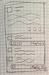
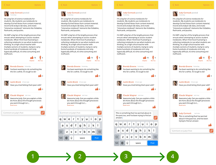
Each card could be tapped on to bring the user into full focus of the content, what we called "Single Item View." This would allow the user to be brought deeper into the conversation on that piece of content. We also explored threaded replies within comments of a post, and this needed to be tested with users.
I had video calls with several teachers and gave them a prototype to test "Single Item View" and commenting. I prompted them with multiple questions on how they felt about the "Single Item View" (asking "Why?" often), what they thought of the comments, and how they expected replies to those comments should work.
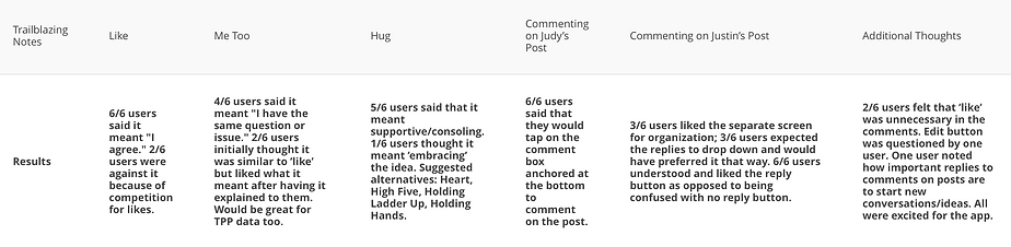
It turned out that "Single Item View" was a great way to focus content, but there was no strong consensus on how threaded replies would work (results from test in chart below). Based on time constraints, threaded replies weren't a high enough priority, and something that we set aside to learn from comments as a whole first before implementing.
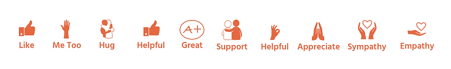
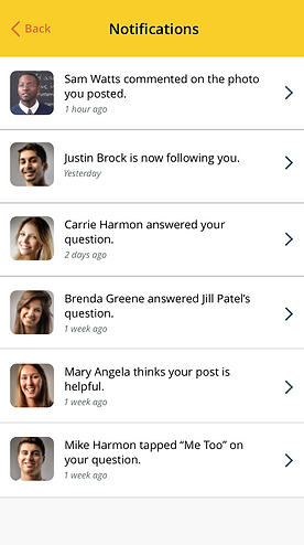
I also tested several emotional and short responses that would be useful for each piece of content, such as "Helpful", "A+", "Hug", "Handshake", "Empathy", and "Support". Even marking content as "Me Too", which meant that you have the same feelings as the teacher who posted the content.
I tested emotional responses by giving users a prototype of our feed with example posts, and asked them what responses they found most useful. It turned out that "Helpful" and "Me Too" were the strongest candidates, because "Helpful" was seen as stronger than a simple "Like", and "Me Too" would give a sense that teachers were not alone in their thoughts and feelings. Almost any piece of content could be marked by both of those responses, and some of the other responses were not appropriate for a professional network (ex: "Hug").
Our final testing results confirmed that a feed with posts which allowed teachers to comment and react to posts would suit their needs. In the end, we tested several names for the section, such as "Newsfeed", "News", "Posts", and "Ideas". We decided on "Discover", because it appealed to teachers as a place to explore new ideas and stories from others.
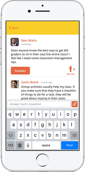
Q&A section: Ask and answer teaching questions
Based on research, teachers needed a way to ask and answer questions in the app, and this felt separate from posting because these questions needed direct attention and needed to be answered by the right teachers.
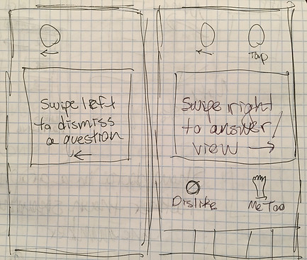
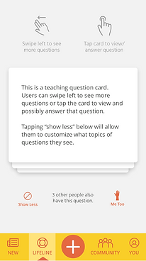
This was originally designed to show cards that could be swiped through to be answered or skipped. However, it didn’t test well because it was only one at a time and users felt guilty skipping too many questions.
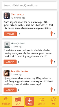
We then turned the Q&A Section to a feed of questions (not only did it test well, but it saved our developers lots of time because they could re-use elements from the Discover section). This way users could browse the questions (not feeling guilty when scrolling instead of swiping), tap on them to answer them, and easily search for questions that they wanted answers to.
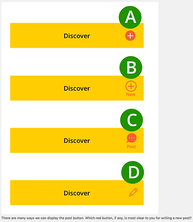
We struggled finding the right place to put an "Ask Question" button, and had the same issue for "Create a Post" in Discover. Before sketching possible solutions, I tried to understand the problem more. I did this by going back to some of our prior tests where I asked teachers how they expected to create a post in Discover. Many said that it was hard to say because they might want to make a post from anywhere in the app while using this. I did some A/B testing after creating some quick mock-ups and a user survey with 10 teachers.
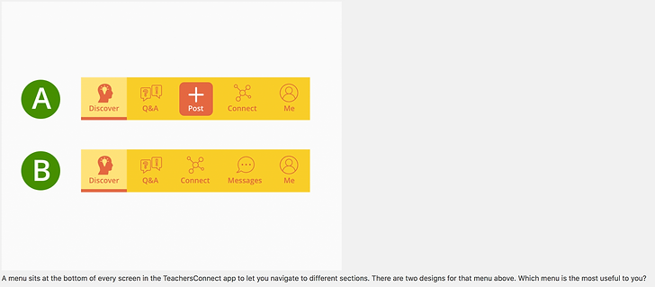
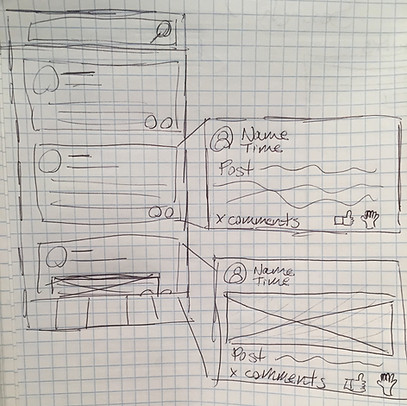
There were many places where a "Post" button could be located. On this specific question, users preferred option A and explained why. However, when they were shown that they could post from the menu (pictured below), an overwhelming majority liked option A because it combined creating posts and asking questions into one button, and it could be accessed from anywhere in the app.
After testing proved that teachers could easily ask and answer questions in the Q&A section, we moved on to the Connect section, giving teachers different avenues for connecting to one another.
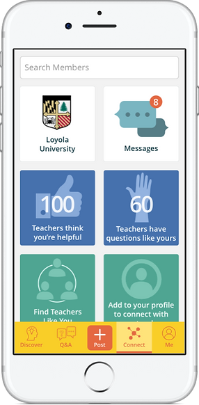
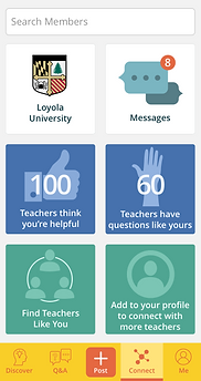
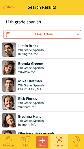
Connect section: Find teachers like you, direct messages, and re-connect with alumni
Based on initial research, teachers needed a way outside of reading posts and questions to connect to teachers that teach the same grades and subjects as them, as well as connecting with their former alumni from their universities. They also needed a way to see how they were positively impacting the entire community, and based on testing, that belonged here since it was dealing with other members.
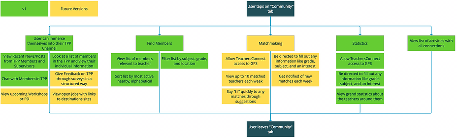
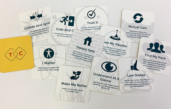
I created a user flow and features chart for the team to go by. Throughout our design sprints, we referred to this chart and changed many priorities based on feedback.
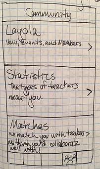
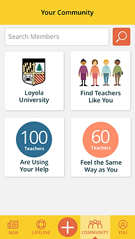
Originally imagined by the team as a list of items to choose from, I had the idea to create interactive tiles. After sketching many ideas and doing some paper prototype testing with some users, we settled with the simplest one for development. Each tile was thought out carefully.
The types of testing done for each tile were actually prompted outside of the section, such as “Say you wanted to search for a teacher friend, where would you go to do that?” Every teacher we tested would tap “Connect” because they knew they were going to be connecting with a person, and then “Search Members”.
Then, within each section, I tested for usability and for feelings and reactions of our teachers. Again, this app really needed to work for all teachers, young and seasoned, so ease of use was the number one concern. This was done mainly by letting them explore my prototype. If they skipped over a section, I would ask them why they didn't notice it or if the way it was presented was misleading.
Feedback was very positive. We even checked in with universities (that would get their own dedicated space, see the "Loyola Tile"). One school of education dean said, "Your app is awesome, by the way. It’s really user friendly. I’m in love with the whole app, it’s modern. The teacher in me just jumps at this.“
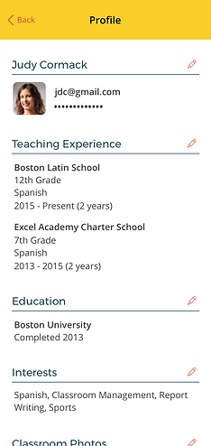
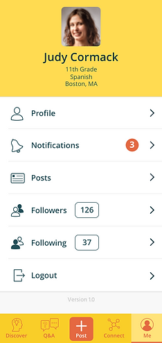
Me section: Profile settings
For the last section, based on research, users needed a way to edit their profile, and change any settings for their app. Originally designed as a list of items, (and eventually expanded to show the brand colors), it was still kept minimal for both development reasons and simplicity. Profile items were discussed and tested depending on what teachers wanted to see from others and what they were comfortable with sharing based on testing.
Onboarding
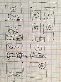
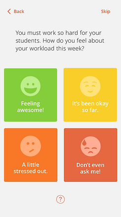
Onboarding needed to be as quick and friendly as possible while receiving some personal information from teachers. I had many different ideas, such as having a chat-bot like conversation, asking “How are you feeling today?", and screens that explained each question.
Based on testing, I ended up with the fastest route to finishing a profile, with a simple screen in the beginning that explains why we need personal information. The rest of the screens look like the one pictured below to the right. During testing, this eased the user enough for them to fill out their information, as quickly as possible.
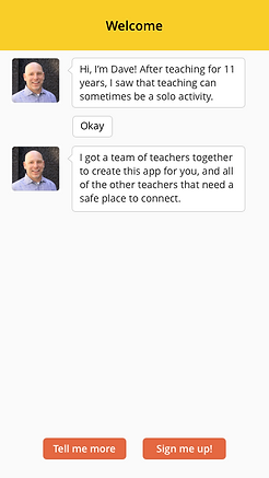
Chat-bot that didn't test well.
Friendly, but too time-consuming.
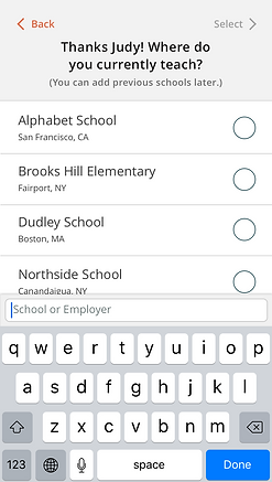
Quick, simple, tested well.
Next Steps
After launching the app, we went through a few months of bug testing and getting feedback from users. There were many features (such as the Connect section) that were put on hold while the first major bugs were taken care of in the app.
In the spirit of "mobile first", this project helped serve as the foundation for a web version that was later launched so that any teacher can have access to TeachersConnect no matter what device they use.
After TeachersConnect, I moved on to Wayfair. Check out my first project, Wayfair Asset Management!